6.
Example of Program Execution Using Demo Data
This page illustrates how
BIDO can be used in the three following cases using demo data.
- Demo of preprocessing (click here)
- Demo of a huddle test (click here)
- Demo of array data
analysis (to follow immediately below)
Demo of Array Data
Analysis
We use synthetic demo
data simulating array observation) to illustrate how to execute the program.
The following illustrates how it can be executed on Windows, but the method is
the same on Linux.
Expand BIDO2.0.tgz using
decompression software. You will find the following files inside it:
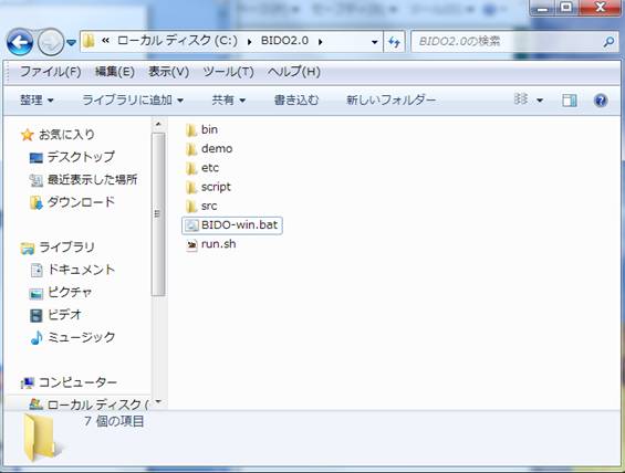
The folder
demo\synth_SN100_18mGamR0.8RV0.1N6 contains synthetic data for demo analysis.
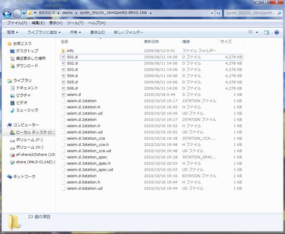
The folder Info contains
information on the synthetic data. There are six files named in the format
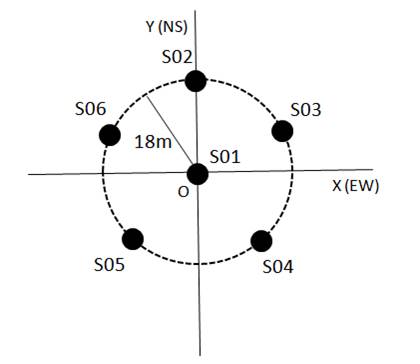
S0x.d. These are microtremor waveform data obtained by assuming six seismic
sensors, named S01 to S06, in the configuration shown below. These are,
however, synthetic data created numerically for demonstration purposes. The
data were synthesized by simulating three-component observation at a sampling
time interval of 0.01 sec and a duration of 5 minutes. Click here for details on the microtremor
waveform synthesis.
Open S01.d with any
editor, and you will find:
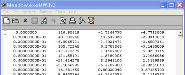
The left-hand side column
stands for time, and the rest stand for the amplitudes of the vertical (z), EW
(x) and NS (y) components, from left to right.
When
you analyze your own measurement data, format them in four columns if they are equipped
with all three components. If they have the two horizontal components alone,
format them in the same way by inserting zeroes or any dummy data where the
vertical component should be. If they have the vertical component alone, let
there be just two columns for time and the vertical component (there can be
four columns as in the case of three-component data, but there is no need for
inserting dummy data). This is because my own measurements
were often for the vertical component alone but were never for the horizontal
components alone (because of the seismometer setup, measurement of the
horizontal components was always accompanied by measurement of the vertical
component).
The analysis method of
this program presupposes that waveforms are sampled at equal time intervals.
The time column should therefore be unnecessary as long as the start time and
the sampling time interval are given (you can even do without the start time in
practical array data processing). If you are already familiar with array
analysis of microtremors, you may wonder why the first column is necessary. In
fact, the string of time data in the first column are dummy and are
actually not read (whatever figures you may put in the first column have no
influence on the analysis results). I created this column simply because the
graphics tool, which I was using to verify the measurement data, required a
format of time and amplitude pairs (analyzing waveforms, plotted and verified
on the spot, was the most efficient way). As I will mention below, the sampling
time interval should be given in a file named seism.d (seismfile).
Anyway, as long as the
data are aligned in this way, the data type can be anything like velocity or
acceleration, and can be of any unit. There is no constraint on the format of
the numbers (be it with an exponent part or with a floating point). Separators
between the numbers can either be spaces, tabs or commas. There is no
particular rule on the naming of data files (they can even lack the extension
*.d). When you have created data files, one for each seismic sensor, place
them all within a single folder. Let all waveforms in the data files start at
time zero.
You will find a file named
seism.d in the same folder. Open it to find:
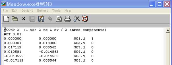
The number in the first
row indicates the components to be used in the analysis. In the second row is
the sampling time interval of the waveform records (#COMP and #DT are a sort of
spells and cannot be omitted). In the third and following rows are the x- and
y-coordinates (km), data file names and center/periphery IDs (1 for center and
0 for periphery). The file name seism.d cannot be modified, and it should be
stored in the same folder as the measurement data. This file need not, however,
necessarily have been created beforehand. When the data folder lacks this
file, the program simply asks for necessary information and automatically
generates one.
In this example, the
origin of the x- and y-coordinates is set at the array center, but this is not
obligatory. The program is written in such a way that it calculates information
necessary for the array analysis, or the center location and the radius, by
using information on the first three circumferential stations in the stations
list. It also verifies whether the other stations lie precisely at the center
or around the circle. The stations around the circle do not need to be
equidistant (see Reference [2] for
theory) but, to warrant precision, please make sure that the array station
distances are as even as possible. When a station does not lie on the circle
(has an error in the radial direction), it is interpreted as lying around the
circle as long as the error is less than the default tolerance limit of 5%,
because there is no theory for correction.
With BIDO 2.0, it is now
possible to conduct huddle tests (tests to confirm the agreement of all
instrumental properties by huddling all seismic sensors at a single location)
(demonstration of a huddle test).
Please assign identical x- and y-coordinates to all data points when you wish
to conduct a huddle test. In that case, the flow of analysis is different from
what is explained below. Power-spectral densities, magnitude-squared coherences
and phase differences are the quantities to be calculated.
Click here for a description of seism.d at a
glance.
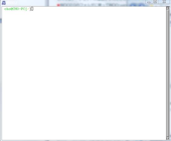
Now that you know what data set there is, let us start the
analysis. Go back to the BIDO 2.0 folder and double-click BIDO-win.bat. This
opens up a window (terminal) like the following (this action is not necessary
on Linux).
Type "run.sh" on
this terminal and press the return key, and you will see
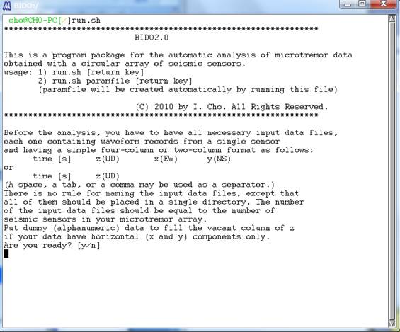
In the above and all
following screens, simply type "y" or press the return key (to use
default parameters). You will finally come down to the following screen:
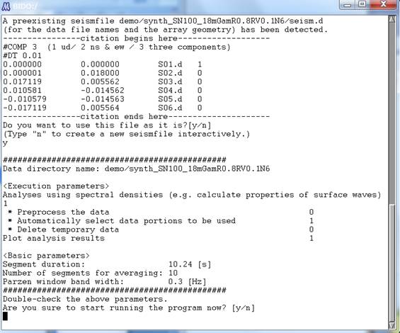
You will find, between the
two rows of "###...," the parameters you entered. When you are
analyzing your own measurement data, be sure to take a look at detailed descriptions of the questions asked
and knacks for parameter setting.
In the present demo, the
default answer to the third question "Preprocessing the data?" is
"n". It is sometimes effective to preprocess the data when you are
using measurement data, but this is not the case in this demo because it uses
synthetic data. I skip explanations for the sake of simplicity. Click here for more details.
At any rate, you were
being asked, in the above screen, whether is it okay to proceed with analysis
with the values shown. Let us type "y" anyway.
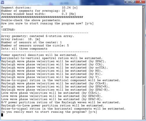
The program then lays out,
as shown above, what analysis output there will be if you conduct the analysis
under the current array geometry. Type "y", and the rest of the
analysis will proceed automatically.
Soon after the analysis
begins, prior to data processing for the estimation of spectra, there appears a
plot of the waveforms, and information on which parts of them will be used in
the spectral analysis (see the figure below. Waveforms are shown in red, and
the parts of them used in the spectral analysis are indicated in green plus
signs).
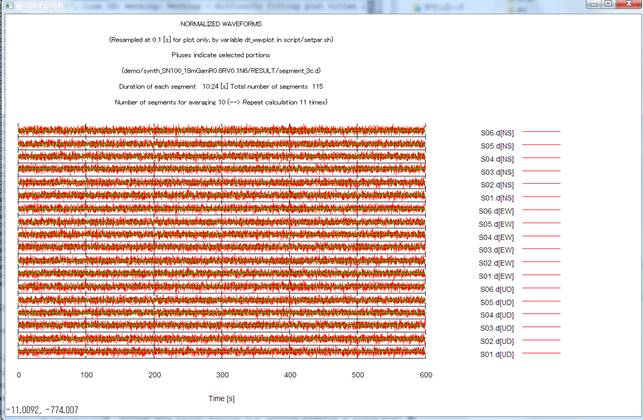
Go back to the interactive
terminal screen and press the return key to erase this plot and move on to the
spectral analysis.
The execution log of the
analysis looks like this (link to the execution log).
This log is generated automatically in the folder where the data files are
stored.
When the analysis is over,
the
- Phase velocities of Love
waves,
- Phase velocities of
Rayleigh waves,
- R/V spectrum of Rayleigh
waves,
- Comparison of the R/V
spectrum of Rayleigh waves and the H/V spectrum,
- Shares of Rayleigh waves
in the total power of horizontal motion,
- NS ratios (inverse of
the SN ratios)
- H/V spectrum, and
- Power-spectral densities
are plotted. Below I
explain them one after another.
1) Phase velocities of
Love waves are shown in data points with error bars (standard deviations). The
horizontal axis stands for the frequency, and the vertical axis stands for the
phase velocity.
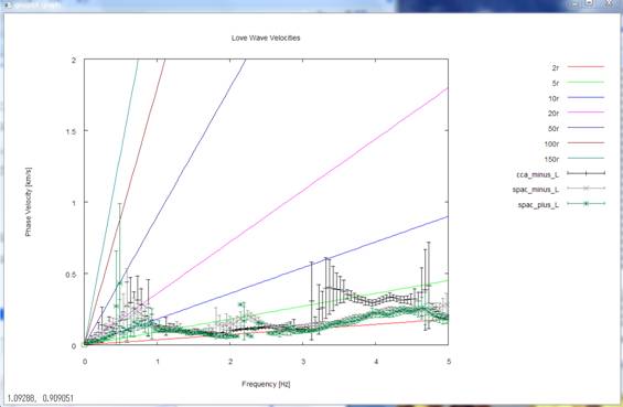
Analysis results from
three methods, called the CCA-L, SPAC-L and SPAC+L methods, are shown superimposed
on one another. The straight lines that emanate from the origin point stand for
wavelengths of 2, 5, etc. times the array radius r (for reference). The
prescribed Love-wave phase velocities (see details
of the synthetic data) have seemingly been reproduced within a
frequency range of about 1-2 Hz.
Incidentally, the range
(upper limit) of phase velocities plotted has been adjusted automatically in
the graph above. If you wish to adjust it on your own (prescribe a fixed value
to it), revive the commented-out parameter ymax_for_gnuplot
in \script\setpar.sh (delete the # at the head of the line) and assign an
appropriate value (phase velocity [km/s]) to it. Likewise, if you wish to
prescribe the range (upper limit) of frequencies on your own, revive the
commented-out parameter xmax_for_gnuplot in
\script\setpar.sh (delete the # at the head of the line) and assign an
appropriate value (frequency [Hz]) to it.
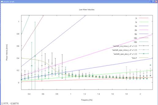
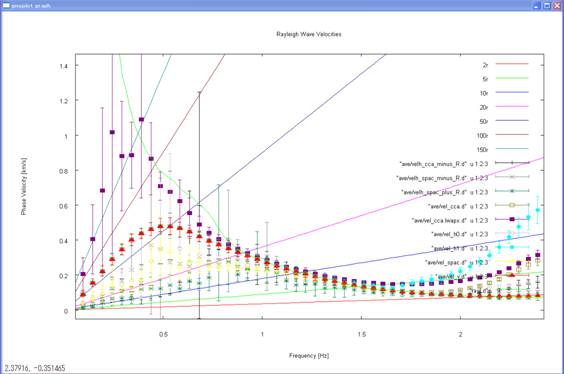
Below is an enlarged view,
for reference, of the comparison, between approximately 0.4 and 2.2 Hz, of the
phase velocities prescribed during the computation of the synthetic data (solid
curve) and the analysis results. With gnuplot, it is fairly easy to enlarge
specific parts of a plot. See gnuplot manual pages for more details.
2) Go back to the terminal
and press the return key. This will take you to the following plot of the
analysis results for phase velocities of Rayleigh waves.
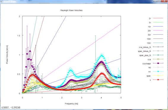
Analysis results from the
CCA-R, SPAC-R and SPAC+R methods (using horizontal-motion records) and the CCA,
nc-CCA (denoted as CCA-lwapx), H0, H1 and V methods (using vertical-motion
records) are plotted simultaneously. The prescribed Rayleigh-wave phase
velocities (see details of the synthetic data)
seem to have been reproduced within a frequency range of about 0.5-2 Hz. For
reference, below is an enlarged view of the comparison, up to about 2 Hz, of
the phase velocities prescribed during the computation of the synthetic data
(solid curve) and the analysis results. The nc-CCA seems to retain analysis
capabilities down to the lowest frequency among all methods.
3) Go back to the terminal
again and press the return key. This plots the R/V spectrum (amplitude ratios
between the horizontal motion and the vertical motion) of Rayleigh waves (heavy
curve, mean; light-colored curves, standard deviations).
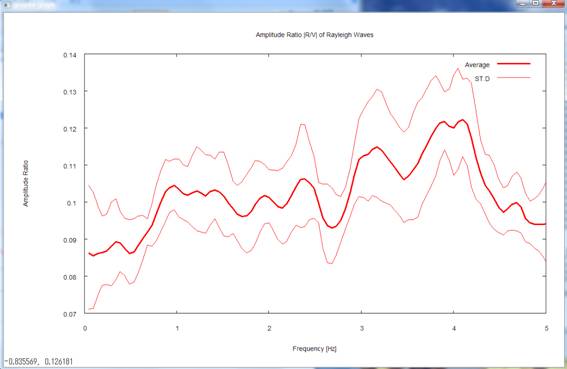
During the calculation of
the synthetic data, I set the R/V spectrum at 0.1 irrespective of the frequency
(see details of the synthetic data).
The analysis results returned comparable values within a frequency range
centered on 1-2 Hz.
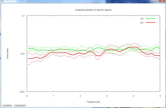
4) Pressing the return key
again takes you to a comparative plot of the R/V spectrum of Rayleigh waves and
the H/V spectrum. Please note that, in this plot, the R/V spectrum is
represented in terms of power-spectral ratios (not in terms of the amplitude
ratios between the radial and vertical components). As I have stated in 3), the
R/V equals 0.1 in terms of the amplitude ratio, so it should be equal to its
square, 0.01, in terms of the power ratio. The prescribed R/V and H/V were 0.01
and 0.0125, respectively, a difference well represented in the analysis results
given here.
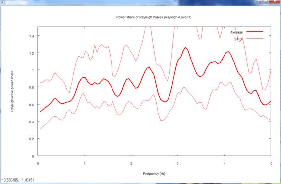
5) Pressing the return key
again takes you to a plot of gR,
the power shares of Rayleigh waves in horizontal motion (gR is defined as the fraction of the power of
Rayleigh waves, with the total power of horizontal motion taken as unity.
Defining gL, the power of Love waves, in a similar way, you
have the relationship gR +gL =
1).
I prescribed gR =0.8 in the synthetic data (see details of the synthetic data). The
analysis results returned comparable values in a frequency range centered on
1-2 Hz.
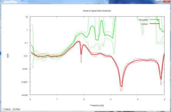
6) Pressing the return key
next time takes you to a plot of the NS ratios (inverse of the SN ratios. Ratios
of the power of incoherent noise to the power of signals) of horizontal motion
(green) and of vertical motion (red).
I set the SN ratio at 100
in the synthetic data (see details of the
synthetic data). This corresponds to an NS ratio of 0.01 because it is
the inverse of the SN ratio. In fact, the analysis results returned comparable
values in low-frequency ranges below 1 Hz.
Pressing the return key
again leads you to a plot of the NS ratios of vertical motion (red) alone,
accompanied by a blue and a pink curve denoted "Upper limit."
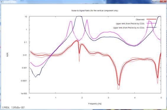
The pink and blue curves in
the above figure denote the threshold NS ratios, calculated using phase
velocity estimates from the CCA and nc-CCA methods, respectively. A threshold NS ratio is a
reference value to be used to assess the reliability of phase velocity
estimates from the CCA method (not the nc-CCA method). When the observed NS ratios exceed the
threshold NS ratios, the phase velocity estimates from the CCA method tend to
be underestimates. In the above figure, red > pink (or red > blue)
below about 0.7 Hz, so there is anxiety that the phase velocities inferred by
the CCA method may be underestimates in that frequency range. A look at the
analysis results in step 2) confirms that this is in fact the case. On the
other hand, the nc-CCA method is a method to correct for underestimations due
to noise (nc stands for noise-compensated) (Reference
[4]). As you can see in the plot in step 2), the nc-CCA method is able
to retain analysis capabilities down to lower-frequency ranges as long as the
NS ratios are evaluated accurately.
The threshold NS ratios
have thus been plotted for vertical motion, but not for horizontal motion. This
is because, for vertical motion, a method to calculate the applicability limit
of the CCA method has been derived theoretically (Reference
[3]) whereas, for horizontal motion, the applicability limits of
relevant analysis methods have unfortunately not been elucidated.
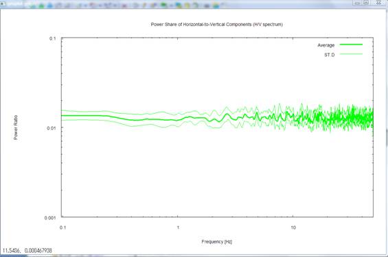
7) Pressing the return key
next time plots the H/V spectrum again. This time, the frequency axis is scaled
logarithmically and is shown up to the maximum frequency. The maximum frequency
refers to the smaller one between the value set by the parameter freqmax_ave in
\script/\setpar.sh (the purpose of this parameter is to reduce the
computation time by letting the averages calculated only up to the set
frequency value. 50 Hz by default, but modifiable
on your own) and the Nyquist frequency. If you do not prefer
logarithmic scaling, comment out the line containing the parameter
autologscale_x in \script\setpar.sh by appending # to the head of the line.
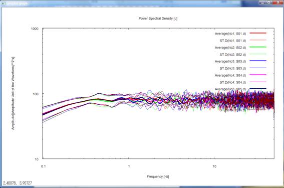
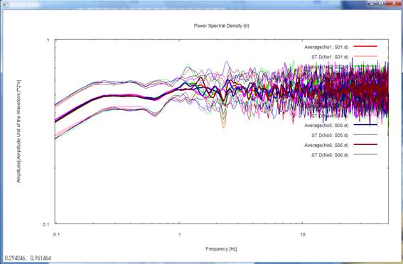
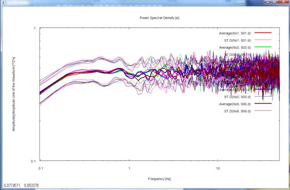
8) Pressing the return key
once again plots the power-spectral densities of all records. Please note that
the frequency axis is again scaled logarithmically and is shown up to the maximum
frequency. The letters u, n and e in parentheses ([ ]) on the right-hand side
of the headline above the figure represents the up-down, north-south and
east-west components, respectively. The numbers in parentheses to the right of
the letters indicating the mean and standard deviation in the legends refer to
the data described in seism.d and are numbered No. 1, 2, and so forth from top
to bottom. To make this point sure, these numbers are followed by data file
names like S01.d.
![]()
This completes the
plotting of the analysis results. When you press the return key, the plot
screen disappears, and on the terminal you see:
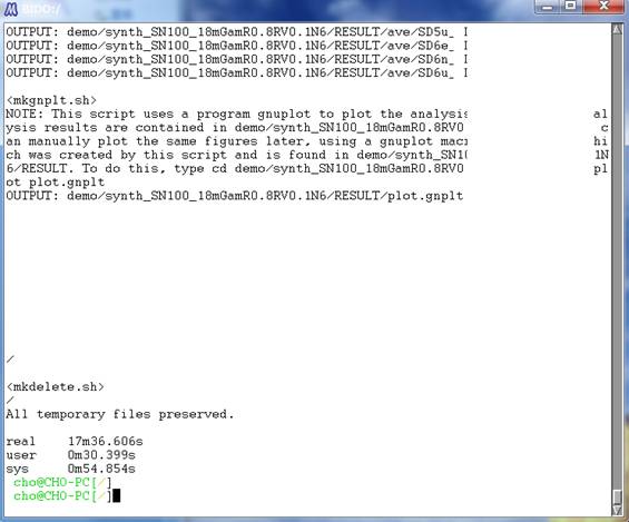
This shows that the
temporary files used in the analysis have been deleted and that the whole
procedure has ended. The figures following the letters real, user and sys in
the last lines indicate the time it took to do the calculations (in this case,
it took 17 minutes in real time after you started the calculations and until
you arrived at this screen). Typing "exit" at the command prompt or
pressing C-Z (simultaneously pressing the control key and the z key) finishes
the terminal screen.
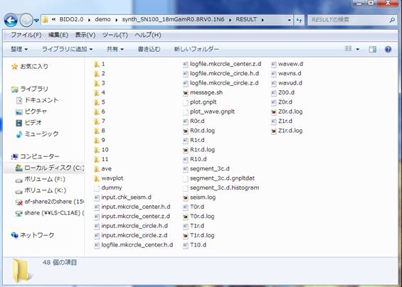
The entire analysis is
over now. All analysis results are stored in a folder, named RESULT, which has
been created beneath the data folder. The following is a look into RESULT
(click here for descriptions of the
individual files):
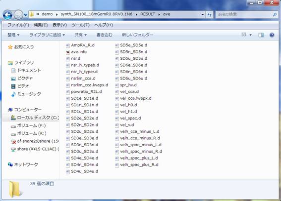
All data files used in the
above plots are stored in the folder named ave (short for average). The
following is a look into ave (click here
for descriptions of the individual files):
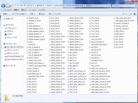
All files in the ave folder
are statistical processings of individual analysis results that are stored in
folders with numerical names like 1, 2 and so forth. The numerically named
folders contain not just the analysis results intended for statistical
processing and storage in ave, but also a variety of analysis results (such as
temporary work files and spectral densities) that are normally not used unless
you want to do in-depth analysis. For example, the folder named 1 contains the
following analysis results (click here
for descriptions of the individual files).
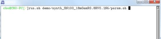
Coming back to the top
data folder, you will find that an execution log, named run.log, and a
parameter file, named param.sh, have been generated alongside the RESULT folder
for the analysis results. The parameter file (param.sh) can be conveniently
used as an argument for run.sh when you rerun the analysis with slightly
modified parameters, like in the following panel:
You may be concerned about
having to type a long path name or mistyping it. Please take it easy, because
there is a typing-aid feature called auto-complete. Auto-complete allows
you to type alphabetic keys only halfway down a word and press the TAB key so
that the rest of the spelling turns up automatically. For example, if you press
run.sh d [TAB]
it automatically turns
into
run.sh demo/
Auto-complete is valid for
the rest of the text. So, if you execute run.sh with a parameter file as the
argument, the dialogue appearing at the start of the program asks you, by
default, about the parameters of the last execution (when the parameters are
not given explicitly like this, default_param.sh beneath the script folder is
automatically read). Note that, when you rerun the analysis, any folders
with numerical names such as 1, 2, and so forth and the ave folder beneath
RESULT are automatically deleted. If you do not wish these folders to be
deleted, you have to move them somewhere else or rename them before rerun.
Finally, in the present
example we have obtained analysis results for the
- Phase velocities of Love
waves,
- Phase velocities of
Rayleigh waves,
- R/V spectrum of Rayleigh
waves,
- Comparison of the R/V
spectrum of Rayleigh waves and the H/V spectrum,
- Shares of Rayleigh waves
in the total power of horizontal motion,
- NS ratios (inverse of
the SN ratios)
- H/V spectrum, and
- Power-spectral
densities,
because we used three-component
array data with a central station. In general, however, the analysis output
(and graphic output) depend on the array geometry (the number of stations
around the circle and whether there is a station at the center) and the number
of components in the data waveforms (vertical motion alone, horizontal motion
alone or all three components). Take a try by editing the seism.d file to set
#COMP at 1, 2 and 3 and by commenting out the line concerning the central
station (in seism.d, appending # at the head of a line comments that line out,
except in the lines for #DT and #COMP). As described in a correspondence table
(here), the analysis output differs according
to the array geometry and the record components. The analysis output is,
however, selected automatically by the program, so the user can rely on an
identical procedure to carry out the analysis. By way of a sample, I have
bundled a few different patterns of seismfile (including seism.d.1.station) in
the folder \demo\synth_SN100_18mGamR0.8RV0.1N6. Please rename each one of them
to seism.d and try rerun of the analysis.